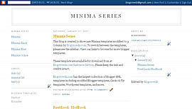
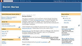
If you need a 3-column template for a new blog or just want to try 3-columns with a test blog, you can right-click, save one of these templates and upload it to Blogger. If you want to use these with your active blog, please note that it doesn't have all your widgets. So, you will have to add them again.
3-column Minima

3-column Denim

3-column Dotsdark

If you already have a functional Beta blog with some other template, here are the steps that you could use to convert your template to 3-columns.
Disclaimer 1: I am assuming that you have already played with CSS a bit.
Disclaimer 2: You may need to do additional adjustments in CSS like adjusting width, margin etc if one of the sidebars is pushed downwards. This instruction is just to highlight the general method of converting to 3-columns. As I don't have much free time nowadays, I may not be able to help you there.
1. Beta template has 3 CSS wrapper definitions as follows:
#outer-wrapper - This defines the entire blog
#main-wrapper - This defines the main column
#sidebar-wrapper - This defines the sidebar.
Now, to insert a new column, we need to define a new wrapper, say #newsidebar-wrapper. Find the definition of #sidebar-wrapper, copy/paste and rename it to create this new wrapper.
2. These wrappers might have different widths depending on your template. We need to fix the widths of these 4 wrappers so that they appear as expected. I suggest setting the width of outer-wrapper as 750px, main-wrapper as 400px and each sidebar-wrapper as 150px (750 > 400+150+150).
3. We should also set the float property of these wrappers appropriately. i.e. if sidebar-wrapper was set as float:right, we should set the newsidebar-wrapper as float:left and vice versa (unless you want both of them on one side). Also, setting the left or right margin of main-wrapper ensures there's space between the new sidebar and the main column.
Summarizing, here is an example of settings:
#outer-wrapper {
width: 750px;
...
}
#main-wrapper {
width: 400px;
margin-left: 20px;
...
}
#sidebar-wrapper {
width: 150px;
float: right;
...
}
#newsidebar-wrapper {
width: 150px;
float: left;
...
}
In the definitions above, ... refers to all other properties within the wrapper.
4. Now that our CSS is ready, let's get to the changes needed in the body of the template. Find the div sections with main-wrapper and sidebar-wrapper and add the code in red either above or below the main-wrapper (i.e. if sidebar-wrapper is below, newsidebar-wrapper goes above and vice versa).
div id='newsidebar-wrapper'>
b:section class='sidebar' id='newsidebar' preferred='yes'>
b:widget id='NewProfile' locked='false' title='About Me' type='Profile'/>
/b:section>
/div>
div id="newsidebar-wrapper">
b:section class="sidebar" id="newsidebar" preferred="yes">
b:widget id="NewProfile" locked="false" title="About Me" type="Profile">
/b:widget>
/b:section>
div id='main-wrapper'>
b:section class='main' id='main' showaddelement='no'>
b:widget id='Blog1' locked='false' title='Blog Posts' type='Blog'/>
/b:section>
div id='sidebar-wrapper'>
b:section class='sidebar' id='sidebar' preferred='yes'>
b:widget id='BlogArchive1' locked='false' title='Blog Archive' type='BlogArchive'/>
/b:section>
(After Copying ADD "<" before code)for close code
If you now goto Template->Page Elements, you will see two sidebars. You could move elements between them and add new elements too. Have fun :)


Good information. Nice post. But i am scared if i can't do it properly.
ReplyDeletevery nice blog !!
ReplyDeleteGreat!great blog!thanks for sharing it!
ReplyDelete